Effective T-shirt logo placement is crucial for creating visually appealing and professional designs. Understanding key positions like chest, back, and sleeves ensures your artwork stands out. Proper sizing, alignment, and balance are essential for a polished look. Mastering these techniques enhances brand visibility and aesthetic appeal.
Standard Print Locations
Popular print locations for T-shirt logos include the chest, back, and sleeves. The chest area is ideal for brand visibility, while the back suits larger designs. Sleeves offer a trendy, subtle placement option. Each location serves a unique purpose in design and branding strategy.
Chest Placement
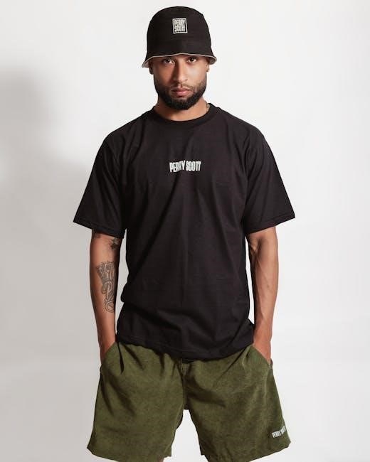
Chest placement is one of the most common and effective locations for T-shirt logos. It offers high visibility, making it ideal for brand promotion. Designs are typically centered and placed 3-4 inches below the neckline, aligning with the armpits for a balanced look. This positioning ensures the logo is easily noticeable without overwhelming the design. For adult shirts, the recommended width is 8-10 inches, while youth sizes may require smaller dimensions. Proper alignment tools, like rulers or guides, help achieve precise placement. Overcrowding the chest area should be avoided to maintain a clean aesthetic. This location works well for both embroidery and screen printing, ensuring the logo remains central and professional. By following these guidelines, chest placement can enhance the overall appeal of your T-shirt design.
Back Placement
Back placement is a popular choice for T-shirt logos, offering a large canvas for bold designs. It is ideal for making a statement, as the entire back of the shirt is visible when worn. The standard positioning for back logos is centered and mid-back, avoiding the neckline and hem. For adult shirts, the design should be placed approximately 6-8 inches below the neckline, ensuring it is not too low or overwhelming. The width of the design can vary, but it should proportionally fit the shirt, typically ranging from 8-12 inches wide for adult sizes. This location is perfect for larger graphics, slogans, or intricate artwork that demands attention. When designing for the back, ensure the logo is balanced and not overly complicated, as it should remain legible and visually appealing. Proper alignment tools are essential to achieve a professional finish. Back placement is particularly effective for promotional items, sports teams, or artistic designs, making it a versatile option for various audiences.
Sleeve Placement
Sleeve placement offers a subtle yet stylish way to incorporate logos or designs into T-shirts. This location is ideal for smaller, simpler graphics that complement the overall aesthetic without overwhelming the garment. The standard position for sleeve logos is on the upper arm, approximately 4-6 inches below the shoulder seam, ensuring visibility without interfering with movement. For a more balanced look, the design can also be placed mid-sleeve, roughly halfway between the shoulder and the cuff. The size of the logo should be modest, typically ranging from 2-4 inches in width, to maintain proportionality with the sleeve. When designing for sleeve placement, consider the fabric type and ensure the logo aligns with the natural lines of the shirt. Tools like alignment guides or rulers are essential for precise positioning. Additionally, avoid placing designs too close to seams or hems, as this can distort the artwork. Sleeve placement is particularly effective for adding a touch of personality to the garment while keeping the rest of the design clean and uncluttered. This technique works well for sports teams, casual wear, or minimalist branding, offering a sleek, modern appeal.
Design Size and Positioning
Proper design size and positioning are critical for achieving a professional and visually appealing T-shirt logo. The size of the logo should complement the shirt’s dimensions, with standard chest designs measuring between 8-10 inches in width for adult shirts, placed approximately 3-4 inches below the neckline. For back placements, larger designs (10-12 inches wide) are common, centered and aligned with the shirt’s natural lines. Sleeve designs are typically smaller, ranging from 2-4 inches in width, positioned 4-6 inches below the shoulder seam. Ensuring the logo is neither too high nor too low is essential for a balanced look. Use tools like rulers or alignment guides to measure and center the design accurately. Avoid placing logos too close to seams or hems, as this can distort the artwork. Always test the placement on a physical shirt to ensure the design looks proportional and visually appealing. Proper sizing and positioning enhance the overall aesthetic, making the logo stand out while maintaining a polished appearance.

Tools for Accurate Placement
Achieving precise logo placement requires the right tools to ensure accuracy and consistency. A T-Shirt Ruler Guide is an essential tool, providing clear measurements for aligning designs on various shirt sizes. This tool is particularly useful for centering chest logos and ensuring proper spacing from the neckline or armpits. Heat press rulers and alignment lasers are also popular, helping to position designs accurately during printing. Digital software, such as design programs, allows for virtual placement previews, ensuring the logo is proportionate and well-aligned before printing. Additionally, physical templates can be used to trace and measure placement areas, preventing errors. For embroidery, specialized guides help mark the exact spot for stitching. These tools not only save time but also reduce the risk of misplacement, ensuring a professional finish. By using these resources, designers can achieve precise and consistent results, making the logo stand out as intended. Investing in quality tools is a key step in mastering the art of T-shirt logo placement.
Choosing the Right Location
Selecting the ideal location for your T-shirt logo is a critical step in achieving a professional and visually appealing design. The placement depends on the desired impact, brand identity, and shirt style. For maximum visibility, the chest area is a popular choice, typically placed 3-4 inches below the neckline and centered. This location works well for both small and large logos. The back offers more space, making it suitable for larger designs or detailed graphics. Sleeves, especially the upper arm area, are great for subtle branding. Hemlines and side panels provide unique alternatives for modern styles. Consider the shirt type, as some designs look better on crew necks versus V-necks. Ensure the logo isn’t too high, low, or off-center, as this can distract from the overall aesthetic. Testing different placements on samples helps finalize the best spot. Balancing proportions and alignment ensures the design complements the garment, creating a polished look that enhances brand recognition. Careful consideration of these factors guarantees a logo that stands out in the right way.
Best Practices for Logo Placement
When it comes to achieving professional results, adhering to best practices for logo placement is essential. Always measure carefully to ensure designs are centered and proportionally sized. Keep logos away from seams, pockets, and zippers to avoid distortion. For chest placements, position the logo 3-4 inches below the neckline, ensuring it aligns with the shirt’s natural lines. On the back, center the design between the shoulder blades for symmetry. Sleeves should feature smaller logos, placed 2-3 inches above the hem. Avoid overcrowding by limiting the number of designs per garment. Use alignment tools or rulers to ensure precision, especially for intricate or large graphics. Test designs on actual shirts before bulk production to verify placement and proportions. Consider the fabric type, as stretchy materials may require adjustments to maintain shape. Finally, balance bold designs with neutral spaces to avoid visual clutter. By following these guidelines, you can create polished, professional-looking T-shirts that elevate your brand or design. Proper execution ensures logos are both visually appealing and enduring.

Advanced Tips for Specific Designs
For intricate or unconventional designs, consider layering techniques to add depth and dimension. Use contrasting colors to enhance visibility, especially on darker fabrics. When working with oversized prints, ensure the design doesn’t overwhelm the shirt by balancing it with negative space. Symmetry is key for professional looks, but asymmetrical placements can create unique, modern aesthetics. For stretchy fabrics, adjust placement slightly higher to account for potential stretching. Incorporate mockup software to preview designs before printing, ensuring optimal fit and alignment. Experiment with vertical or diagonal orientations for a fresh, eye-catching appeal. Avoid overcomplicating designs; focus on clean lines and clear messaging. For embroidery, choose smaller, detailed designs for sleeves or chests, and reserve larger, intricate patterns for the back. Lastly, maintain consistency across different shirt sizes by scaling designs proportionally. These advanced strategies will help you achieve sophisticated, high-end results in your T-shirt designs.
Mastering the art of T-shirt logo placement is a critical step in creating professional and visually appealing designs. By understanding standard print locations, design sizing, and advanced placement strategies, you can ensure your logos stand out while maintaining balance and aesthetics. Always consider the shirt type, fabric, and intended use when deciding placement. Tools like alignment guides and mockup software are invaluable for achieving precision. Remember to keep designs centered, proportional, and appropriately sized for the garment. Whether you’re aiming for a classic chest logo or a bold back design, careful planning ensures a polished finish. Experiment with unique placements and techniques to add creativity while maintaining functionality. With practice and attention to detail, you can elevate your T-shirt designs to professional heights. By following these guidelines, your logos will not only look great but also effectively communicate your brand’s message. Happy designing!